Brand Toolkit
The Lenoir-Rhyne University Brand
The Lenoir-Rhyne University brand is more than a logo—it’s the collective expression of who we are, what we value, and how we communicate. It also reflects how people perceive and experience the university.
From webpages and print materials to apparel, social media, and signage, consistent use of our brand elements builds recognition, establishes trust and connects people to the LR experience.
This guide exists to ensure all marketing and communications—digital, print, visual and verbal—align with LR’s identity and reflect our mission, vision, values and voice.
Brand Voice & Messaging
Our tone is confident, warm, welcoming, inclusive and mission-driven. Whether you're communicating with prospective students, alumni or colleagues, the LR voice should reflect our core values and our commitment to student-centered education.
For most external, institution-level marketing and communications, the Office of Marketing and Communications leads the development and execution of content to ensure consistency in tone, messaging and brand alignment. We collaborate with clients across the university to create materials that reflect LR’s mission, engage key audiences and elevate the university’s visibility and reputation.
To maintain consistency and clarity across all university messaging, departments, divisions, programs, colleges, and other sub-brands may not create or use their own taglines or slogans—especially in connection with LR logos, marks, or names. Creating independent taglines can cause confusion for external audiences, who may perceive them as official university messaging. Even well-intentioned phrases can dilute the university’s brand, compete with institutional messaging, and misrepresent the voice and mission of Lenoir-Rhyne. All messaging connected to the LR brand should align with the university’s established voice, visual identity, and strategic communication goals.
Brand Toolkit
The Brand Toolkit provides the essential guidelines and resources for expressing the Lenoir-Rhyne University brand consistently and effectively. Whether you're creating a brochure, managing a social media account, building a webpage or designing event materials, this toolkit ensures your work aligns with the university’s visual identity, tone and mission.
Within each section, you'll find direction for following best practices, and more. Consistent application of our brand elements helps strengthen LR’s image, build trust with our audiences and communicate the values that define the university.
If you have questions or need help applying these guidelines, the Office of Marketing and Communications is here to assist.
-
Design Guidelines & Best Practices
Printing
Printed materials—from brochures and flyers to banners and postcards—are an important part of how Lenoir-Rhyne University expresses its brand. All print pieces should follow the same visual and messaging standards outlined in this guide to ensure consistency across formats and audiences.
Before beginning any print project that is directed at an external target audience, please consult with the Office of Marketing and Communications to ensure appropriate use of logos, typography, colors and voice. We can also provide design support or refer you to approved designers and printers familiar with LR brand standards.
Best Practices
- Use official university logos, marks, sub-brand lockups with correct sizing, clear space and color usage.
- Maintain typographic consistency by using university-approved fonts
- Apply the LR color palette to reinforce brand identity and visual cohesion.
- Avoid use of unofficial taglines or unapproved variations of the university name.
- Include required statements, such as accreditation or nondiscrimination language, when appropriate.
The Office of Marketing and Communications reviews and approves print materials for external audiences to ensure brand integrity and message alignment.
See also Web & Digital Guidelines.
-
University Logos & Marks
Use of Official Logos & Marks
Lenoir-Rhyne University’s logos and marks are core elements of our brand identity and must be used with consistency, clarity and respect. Proper usage ensures that our communications remain professional, recognizable and aligned with the university’s mission and values.
Clear Space Requirements
To preserve the integrity and visual impact of the university’s logo and marks, clear space must be maintained on all sides. This designated area of isolation protects the logo from visual interference and ensures it remains legible and prominent.
- At a minimum, the clear space should equal the height of the “E” in the Lenoir-Rhyne logo or another unit defined in the official logo specifications.
- No text, images, patterns or graphic elements should appear within this area.
Proper Usage Guidelines
To maintain brand consistency and avoid visual distortion, the university’s logos and marks should:
- Never be stretched, compressed, skewed or rotated.
- Not be altered in color, proportions, typography or elements.
- Not be placed over busy backgrounds or low-contrast areas that compromise legibility.
- Not include effects such as drop shadows, glows, outlines or filters.
- Only be used at sizes that ensure legibility, particularly for digital applications and small-scale print.
Examples of Incorrect Usage

Incorrect use. Not enough space is provided around the logo. Logo is also low quality and pixelated. 
Incorrect use. Crunched/compressed Lenoir-Rhyne logo. 
Incorrect use. Stretched Lenoir-Rhyne logo. 
Incorrect use. Alteration of LR mark. 
Incorrect use: Bear mark change in colors, added artwork, text, etc. When in Doubt
If you're unsure about the proper use of a university logo or mark, or need assistance preparing artwork, contact the Office of Marketing and Communications for guidance and approved assets.
Sub-brand Logos & Marks
Colleges, departments, programs, departments and offices are considered sub-brands of Lenoir-Rhyne University. As such, these entities are not permitted to create their own logo that differs from the approved Lenoir-Rhyne University logo for a sub-brand. Contact Marketing and Communications for design assistance for approved sub-brand logos for colleges, schools, programs, offices, etc. Sub-brands should also avoid the addition of text taglines or other text statements adjacent to Lenoir-Rhyne logos that may be confused as representing the Lenoir-Rhyne brand.
File Types & Resolution
Use the correct file type based on the medium:
- Vector files (EPS or SVG) for print, signage and large-scale applications.
- PNG or JPG files for digital platforms. Ensure resolution is sufficient (300 dpi for print, 72 dpi for web). For digital use, also account for the appearance of logos and marks in both dark mode and light mode on computers.
Logos & Marks Available for Downloading
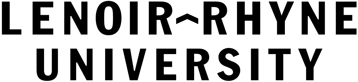
Two-color stacked logo. Preferred logo for all materials and communications.

This is a white/reversed logo on a transparent background.
The black background is used for display only. Don't use a black, red or white rectangle around Lenoir-Rhyne logos as shown.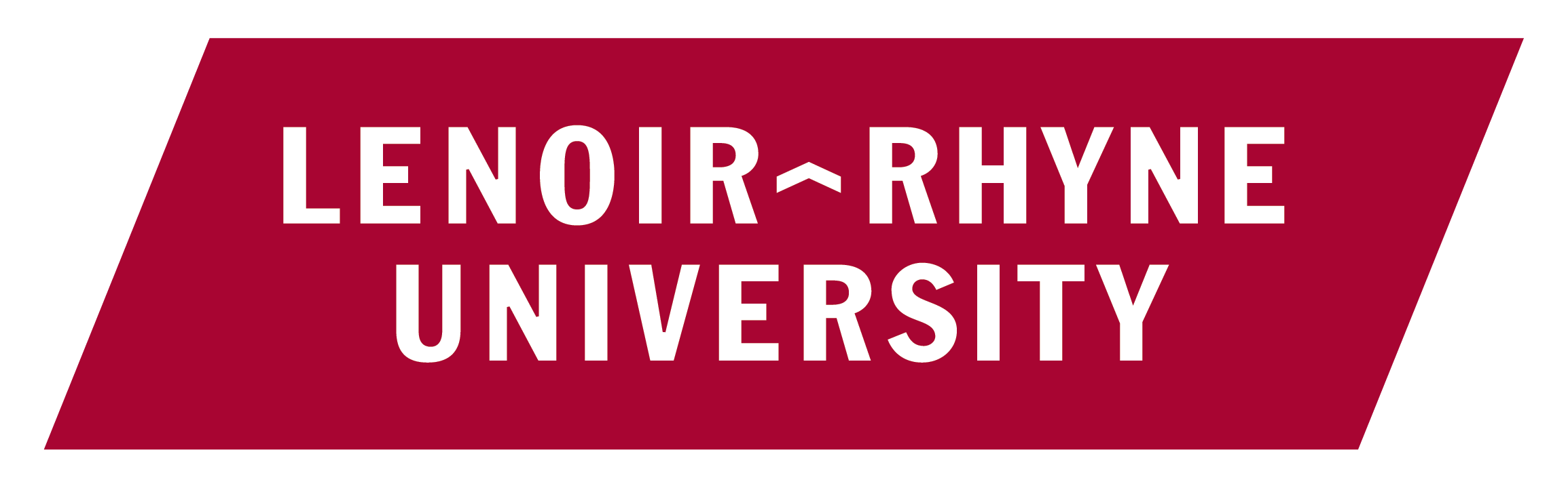
-
Color Palette
Color plays a vital role in expressing the Lenoir-Rhyne University brand. Our color palette is designed to be bold, distinctive and flexible across a range of applications—from print materials and digital communications to merchandise and signage.
Consistent use of brand colors helps reinforce recognition, build trust and unify the LR experience across all audiences. To maintain visual cohesion, primary colors (LR red and black) should be used most prominently, while secondary and neutral colors provide support and flexibility for layout, contrast and accessibility.
Always use the specified color values (PMS, CMYK, RGB and HEX) appropriate to your medium to ensure accurate color reproduction. When designing for print, work with approved vendors or consult the Office of Marketing and Communications to ensure color consistency across materials.
Primary Colors
Color Print Web LR Red PMS: 201 C
CMYK: 24,100,78,17
RGB: 164,31,53#a31f34 Black CMYK: 0,0,0,100
RGB: 0,0,0#000000 White CMYK: 0,0,0,0
RGB: 255,255,255#FFFFFF Secondary Colors
Color Print Web Heath CMYK: 41,90,73,62
RGB: 80,20,29#52101a Tan CMYK: 15,13,21,0
RGB: 216,211,196#D7D2C4 Gray Shades - 20% black for light backgrounds or subtle dividers
- 40–60% black for body text, infographics or muted elements
- 80–100% black for headlines, emphasis or maximum contrast
See Digital Style Guide -
Typography
Lenoir-Rhyne’s brand typography is structured into two typeface families that work together to create a distinctive and accessible voice across all platforms.
Primary Typeface
Our primary typeface is Franklin Gothic, which is used for titles, headlines, subheads and other prominent text. It reinforces brand recognition and creates strong visual hierarchy when used consistently. Listed are below are fonts that are typically used in print. Refer to the Adobe Fonts website or the typography section in the Digital Style Guide for additional information.
- Book
- Book Italic
- Book Compressed
- Book Compressed Italic
- Demi
- Demi Italic
- Demi Compressed
- Demi Compressed Italic
- Heavy
- Light
- Medium
Secondary Typefaces
The secondary typeface is primarily Museo Slab, but sometimes Proxima Nova may be used. Both are designed for body copy, long-form text, captions and supporting information. It provides readability and complements the primary typeface in tone and structure. Refer to the typography section in the Digital Style Guide for additional information about secondary typefaces for digital use.
Museo Slab
- 100
- 300
- 300 Italic
- 500
- 700
- 700 Italic
Proxima Nova
- Thin
- Thin Italic
- Light
- Light Italic
- Regular
- Italic
- Medium
- Medium Italic
- Semibold
- Semibold Italic
- Bold
- Bold Italic
-
Web & Digital Guidelines
Our digital style guide and library provides guidelines for usage, documentation and raw code for all of Lenoir-Rhyne University digital patterns, components and templates. All of this is provided to assist you and LR's campus partners in creating, designing and developing robust and accessible digital experiences across all Lenoir-Rhyne University digital properties.
Before beginning a website or digital project, please contact Doug Minor, associate vice president for marketing and communications, at doug.minor@lr.edu to review your goals, objectives and accessibility compliance for your project. All websites and digital projects must be compliant with federal website accessibility requirements, which are WCAG 2.0 Level A and Level AA. LR currently strives for WCAG 2.2 Level A and Level AA compliance.
View Digital Style Guide -
Photography & Video Guidelines
We strive to capture photography and video content that authentically embodies the essence of the LR brand. Our commitment is to deliver visuals of the highest quality, executed in a candid and journalistic style. These visuals are more than just images; they are the visual language that speaks to the heart of LR's identity. In this brand guideline, you will find the principles and standards that guide our visual storytelling, ensuring that every image and video reflects the core values and personality of the LR brand.
To assist you in capturing the best possible photography and video, we have produced the following two guides which are useful whether you are using professional equipment, your smartphone or computer.
Photography & Video Principles
- Quality Above All: Our visuals should always strive for excellence. We aim to create photographs and videos that are not only technically superior but also emotionally resonant. Attention to detail, sharpness and color accuracy are our top priorities.
- Candid and Journalistic Style: LR is about authenticity, and our visuals should reflect this authenticity. We prefer candid and journalistic styles that capture real moments, real people and real emotions. Our content should tell a genuine, unscripted story.
- Consistency: Consistency in style and tone is crucial for building brand recognition. We maintain a consistent look and feel across all photography and video content to reinforce the LR brand identity.
Photography Guidelines
- Natural Lighting: Whenever possible, use natural lighting to create a warm and inviting atmosphere in our visuals.
- Minimal Editing: Keep post-production editing to a minimum. Our goal is to showcase the true essence of the moment.
- Inclusivity: Our visuals should represent the diversity of our audience and the inclusivity of the LR brand. Ensure that our photographs reflect a broad spectrum of genders, majors/programs, races/ethnicities and backgrounds to accurately reflect the LR community.
Video Guidelines
- Storytelling: Every video should tell a compelling story that aligns with LR's values and messaging. Use a narrative structure to engage viewers.
- Cinematic Techniques: Employ cinematic techniques, such as creative framing, smooth camera movements& and selective focus, to enhance storytelling.
- Sound and Music: Pay close attention to sound quality and music selection. The audio should complement the visuals and evoke the desired emotional response.
Branding Elements
- Logo Usage: Use the official Lenoir-Rhyne logo and LR mark according to brand guidelines—maintain proper size, clear space and approved colors.
- Typography: Apply university-approved fonts consistently in all text overlays, lower-thirds and graphic elements to support brand recognition.
- Color Palette: Use only the official LR color palette to reinforce a unified visual identity.
- Brand Language: Sub-brands (programs, departments, divisions, centers, colleges, offices, etc.) may not create or use their own taglines or slogans. All messaging must align with the university’s overarching voice.
By following these brand standards, we ensure every expression of the LR brand reflects our commitment to quality, authenticity and a unified voice. Consistent storytelling strengthens our impact and reinforces what it means to be part of the Lenoir-Rhyne community.
-
Email Signatures
Your email signature is an extension of the Lenoir-Rhyne University brand. A consistent, professional signature helps reinforce our identity, communicate clearly and maintain credibility with internal and external audiences.
The following guidelines outline the standard format and content for university email signatures.
Standard Format
All faculty and staff should use the standard signature format below. The university name should be bolded and appear in LR Red (Outlook’s default red or Hex #a31f34). Font should remain consistent with the email body text—typically Calibri or Arial, 11 pt.
Example:
Jane Doe, Ph.D.
Director of Marketing and Communications
Lenoir-Rhyne University
625 7th Ave NE, LRU 7483
Hickory, North Carolina 28601
jane.doe@lr.edu
W: 828.328.5555 | C: 828.555.5555.
www.lr.eduDo Not Include
To ensure clarity and brand consistency, signatures should not include the following:
- Inspirational quotes, personal sayings or religious verses; or links to non-lr.edu webpages that include any of these items
- Taglines, slogans or mottos that have not been officially approved by the university
- Images, clipart or non-university logos
- Vintage or university logos that are no longer approved for official use
- Decorative fonts, emojis or excessive styling
- Background colors, background patterns or alternate text colors (other than LR red for the university name) or black for signature text.
- Typography or fonts that are not considered professional
- All-image signatures where the text is conveyed as an image. All-image signatures are note readable by screen readers and not accessible compliant.
While we respect individual expression and personal beliefs, email signatures represent the university in a professional setting. Consistency in formatting ensures that communications remain inclusive, accessible and in alignment with our institutional voice.
Dark Mode Considerations
Many users now view emails in dark mode, which can affect how your email signature appears—particularly font colors and logos.
To ensure your signature remains legible and professional in both light and dark modes:
- Avoid manually setting font colors other than black for body text and LR red (#a31f34) for the university name. Custom colors may render unpredictably in dark mode.
- Avoid using white or light-colored text. In dark mode, manually-set light colors may not adjust properly and can become unreadable against dark backgrounds.
- Do not place your signature text over a background color or image. Backgrounds may not render consistently across email clients or dark mode settings.
- Minimize or avoid logos and images. Transparent PNGs and images with dark elements may not display well in all email clients or when dark mode is enabled.
- Test your signature in both light and dark mode email settings to confirm legibility and formatting.
While some rendering issues are outside your control, following these best practices helps ensure your email signature remains polished, accessible, and on-brand across devices and settings.
Additional Tips
- Limit to one or two phone numbers (work and cell).
- Avoid using titles like “Mr.”, “Ms.”, or “Dr.” unless necessary for clarity and instead list your academic or professional degree after your name, e.g., Jane Doe, Ph.D. or John Doe, M.A.
- If you are an LR alumnus/a, list your class year after your name, e.g., Jane Doe '01. If you have a graduate degree or higher, list as Jane Doe '01, MBA'05
- If your office has multiple locations, you may include those details beneath your address.
- Optional additions can include professional or licensing credentials or pronouns (e.g., he/him).
-
Licensing, Trademarks & Use of University Marks
Lenoir-Rhyne University logos, marks and name are registered trademarks and may only be used in accordance with university brand standards. These assets represent the university’s identity and reputation and must be used with care and consistency.
Use Requirements
- Only official university logos and marks may be used for marketing, communications and merchandise.
- Sub-brands (colleges, departments, programs and offices) must use the approved university logo or sub-brand lockup. Custom logos are not permitted.
- No alterations (color, proportion or added elements) may be made to any logo or mark.
- Logos or names may not be paired with unofficial taglines or phrases that could be interpreted as university-sanctioned.
Licensed Vendor Requirement
Any item bearing the Lenoir-Rhyne University or LR name, logo or mark—whether for sale or as a giveaway—must be produced by a university-approved licensed vendor.This policy applies to:
- Apparel (e.g., t-shirts, polo shirts, sweatshirts, jackets, vests, hats, uniforms and other clothing)
- Promotional items (e.g., mugs, glasses, magnets, lanyards, stickers, bags, pins, "swag" or tchotchkes)
- Event materials or signage that use the Lenoir-Rhyne LR name or brand
Royalty Guidelines
Items that are sold (e.g., fundraising merchandise or bookstore items) or distributed publicly using university logos or names are subject to royalty fees, which support the university’s licensing and trademark management program. Royalties are typically collected by the licensed vendor and submitted to the university’s licensing partner.To ensure compliance, please consult the Office of Marketing and Communications before placing any order involving university logos, names, or marks.
Brand Licensing Portal
All designed items that use Lenoir-Rhyne or LR logos, marks or the university name must be submitted for review and approval through the LR licensing portal. Only licensed, approved vendors have access to submit items for review and approval through the brand portal. Lenoir-Rhyne partners with Learfield's Collegiate Licensing Company (CLC) portal for the review and approval of submitted designs and maintaining a record of approved vendors.The cost to become a new licensed vendor is $250, which is the administrative fee charged by CLC for processing new applications.
Apply to Become a Licensed Vendor
News & Events
As LR welcomes its largest incoming class since 2020, see the numbers, majors, and fun facts that will make this year’s campus buzz!
View More
LTSS alumni and church leaders can participate in this fall’s Explore courses, exploring holistic Christianity, monastic life and other topics that foster lifelong learning.
View More